Apptimus Blog

Storybook
Storybook is a frontend workshop for building UI components and pages in isolation. It helps you develop and share hard-to-reach states and edge cases without needing to run your whole app. a popular tool used for developing and documenting front-end components in isolation. It helps teams build, organize, and test UI components without relying on a full application context. Link - storybook
Setup the storybook in the project.
- You can install it via terminal with this command npx storybook@latest init.
- To install you need to fulfil these requirements.
- If you are using Next = Next.js ≥ 13.5
- If its React = React ≥ 16.8
- Webpack ≥ 5.0
- Give this command npm run storybook to run the storybook. Then it will start on a different port.
Check their official web docs for the detailed overall explanations - https://storybook.js.org/docs
How its looks and works.
It will start with some basic element which is in the stories folder. You can modify it as your wish
After you load elements it will provide stylings for your customization and options like create stories for the documentation
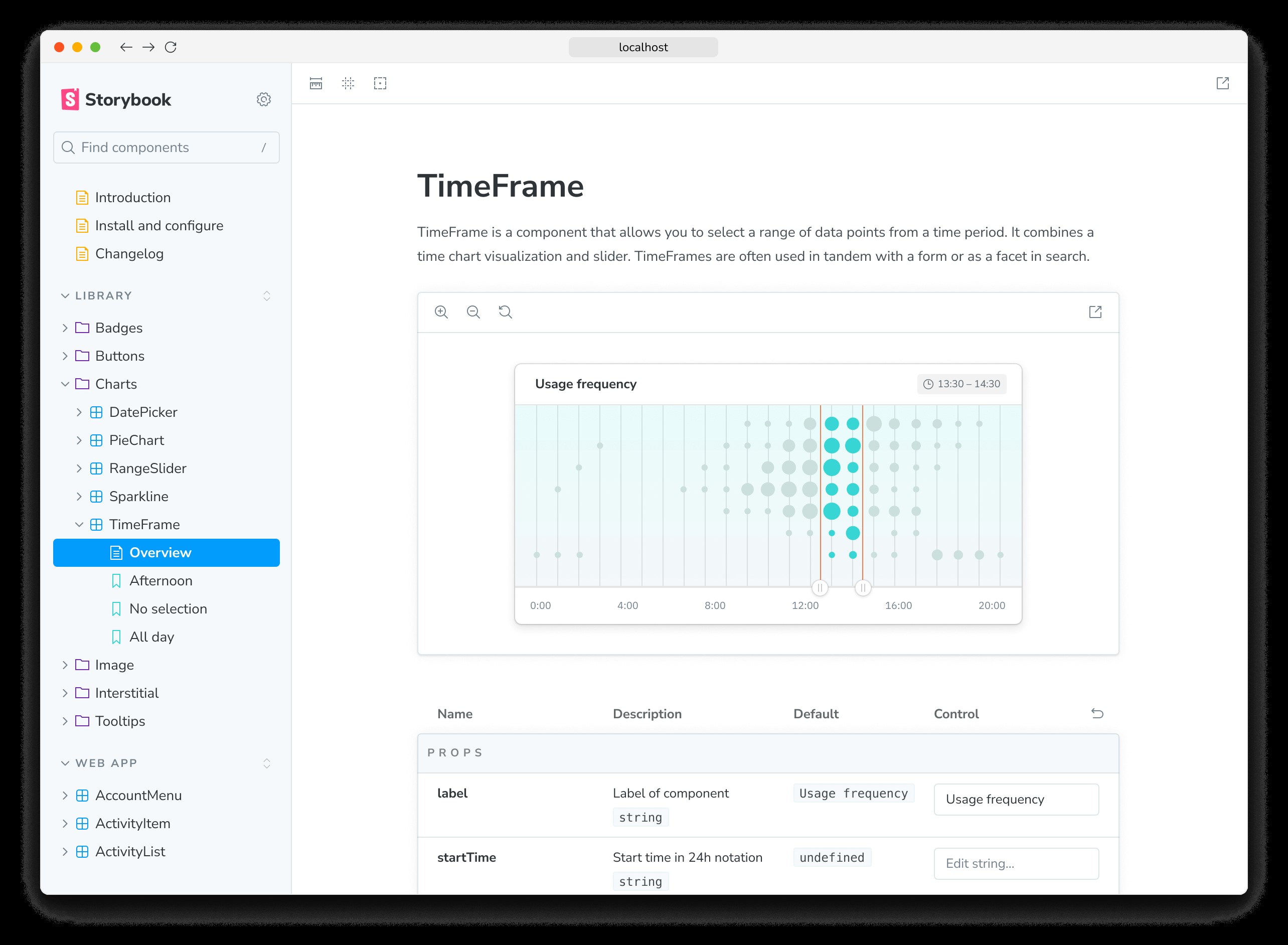
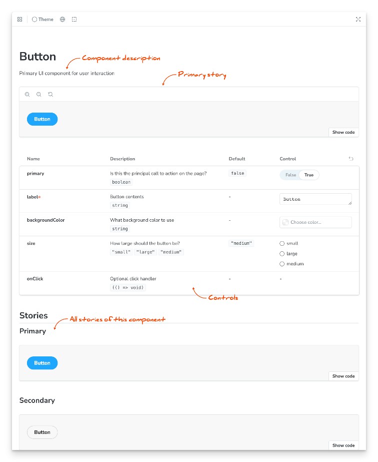
You can customize things in your UI elements like these.
Example workflow:
- Create a component, e.g., a Button.
- Write stories for the Button that showcase different variations (e.g., primary, secondary, disabled states).
- Use Storybook to visualize, test, and document the Button.
- Other team members or stakeholders can review the stories, provide feedback, or use the component.
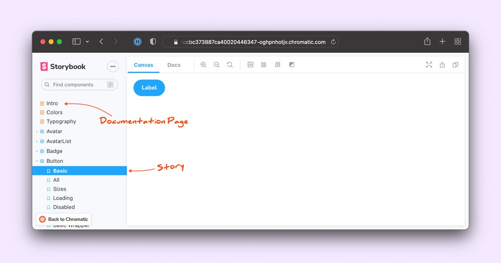
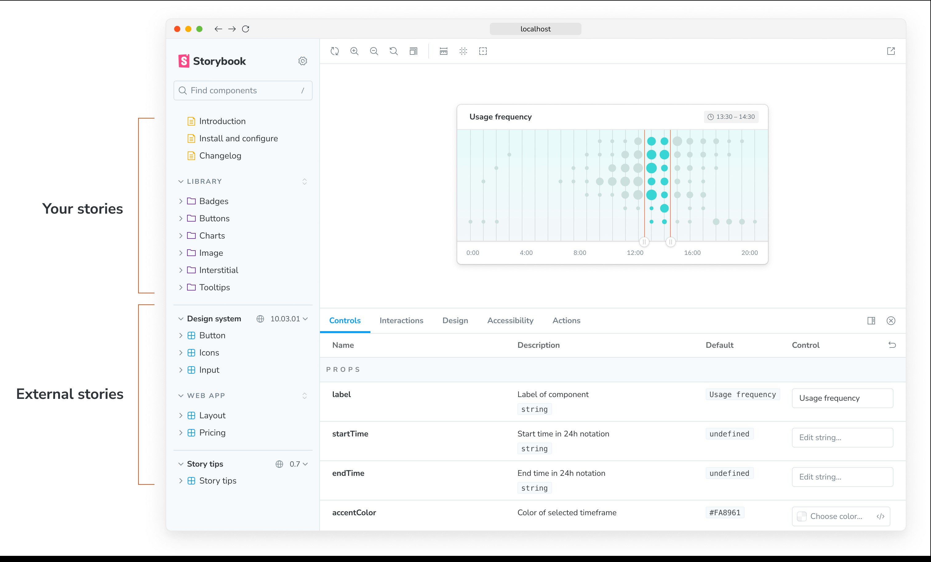
Storybook composition
Composition allows you to browse components from any Storybook accessible via URL inside your local Storybook. You can compose any Storybook published online or running locally no matter the view layer, tech stack, or dependencies.
Compose published storybooks
In your storybook/main.js or ts file add a refs field with information about the reference Storybook. Pass in a URL to a statically built Storybook.
Coding for storybook/main file -> main.ts
// Replace your-framework with the framework you are using (e.g., react-webpack5, vue3-vite)
import type { StorybookConfig } from '@storybook/your-framework';
const config: StorybookConfig = {
framework: '@storybook/your-framework',
stories: ['../src/**/*.mdx', '../src/**/*.stories.@(js|jsx|mjs|ts|tsx)'],
refs: {
'design-system': {
title: 'Storybook Design System',
url: 'https://master--5ccbc373887ca40020446347.chromatic.com/',
expanded: false, // Optional, true by default,
sourceUrl: 'https://github.com/storybookjs/storybook', // Optional
},
},
};
export default config;
You can also compose your stories on different environment. Here a typescript main file for an example
// Replace your-framework with the framework you are using (e.g., react-webpack5, vue3-vite)
import type { StorybookConfig } from '@storybook/your-framework';
const config: StorybookConfig = {
framework: '@storybook/your-framework',
stories: ['../src/**/*.mdx', '../src/**/*.stories.@(js|jsx|mjs|ts|tsx)'],
// 👇 Retrieve the current environment from the configType argument
refs: (config, { configType }) => {
if (configType === 'DEVELOPMENT') {
return {
react: {
title: 'Composed React Storybook running in development mode',
url: 'http://localhost:7007',
},
angular: {
title: 'Composed Angular Storybook running in development mode',
url: 'http://localhost:7008',
},
};
}
return {
react: {
title: 'Composed React Storybook running in production',
url: 'https://your-production-react-storybook-url',
},
angular: {
title: 'Composed Angular Storybook running in production',
url: 'https://your-production-angular-storybook-url',
},
};
},
};
export default config;
Conclusion
Storybook is an open-source tool for developing, testing, and documenting UI components in isolation. It enables front-end developers to build and showcase components independently of the main application, fostering better design systems and improving the development workflow.

Software Engineer, Apptimus